
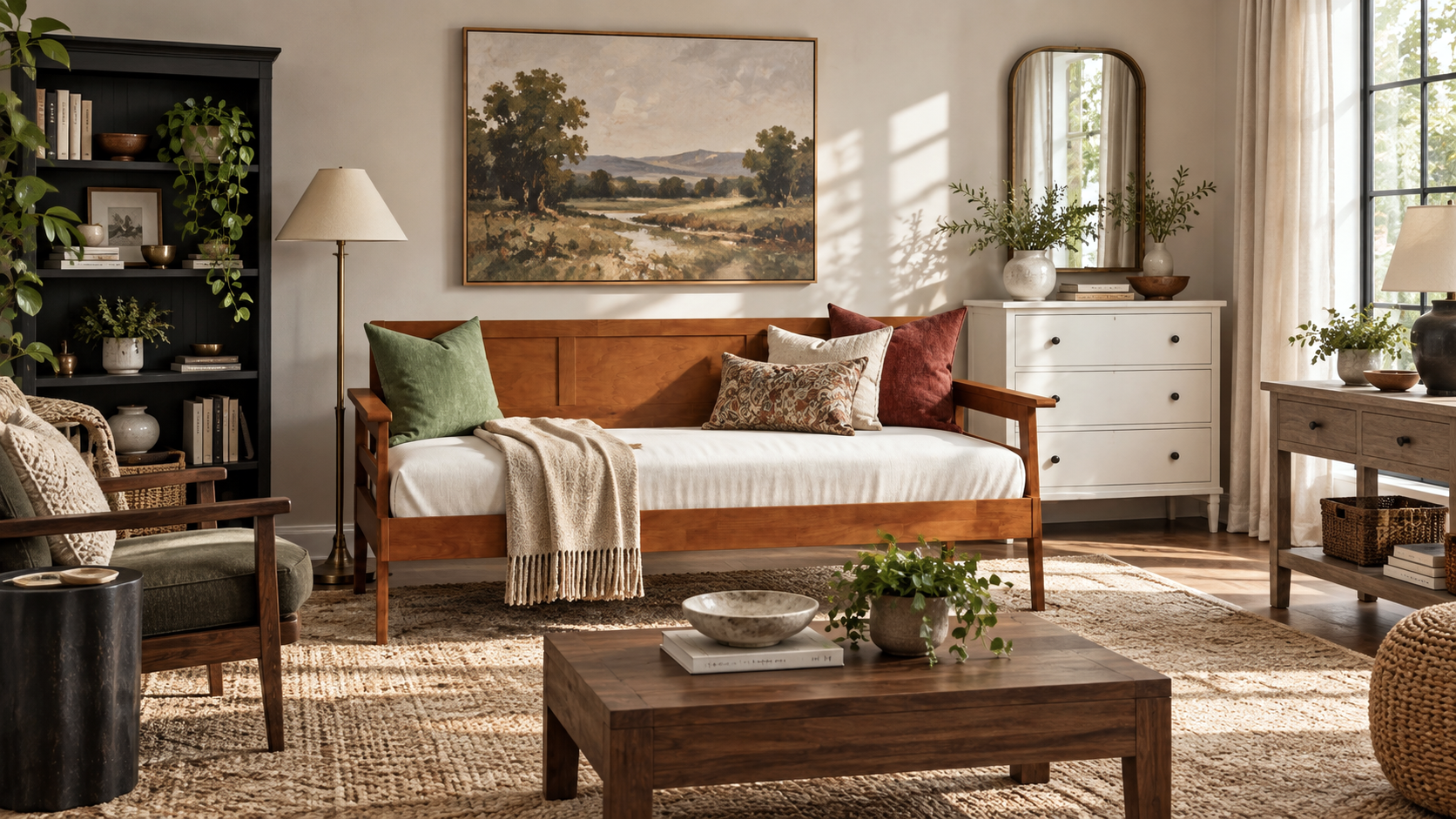
Choosing a furniture finish is about more than picking a color. Stain, paint, texture, wood material, and lighting can all affect how a finish looks in your home.
In this guide, we’ll look at the differences between stained, painted, and wire-brushed finishes, why solid wood and veneer can show color differently, how lighting and screens affect what you see, and how some of AFI’s most popular finishes compare.
We’ll also cover how to mix different wood tones in the same room without everything needing to match.
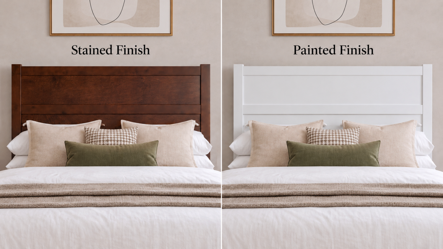
Stain changes the color of the wood while allowing the grain and natural variation underneath to remain visible. AFI’s stained finishes include Walnut, Barnwood, Espresso, Light Toffee, and Teak. They also have a slightly glossier appearance, which can make the grain and depth of the wood more noticeable.
Paint creates a more opaque, uniform color. AFI’s painted finishes include White, Grey, Black, and Pink. These finishes have a more matte appearance, so they reflect light more softly and show less of the natural variation beneath the surface.
If you want more visible wood character, a stained finish may be the better fit. If you prefer a cleaner, more consistent look, a painted finish may make more sense.
All AFI Furnishings finishes are non-toxic and low-VOC.
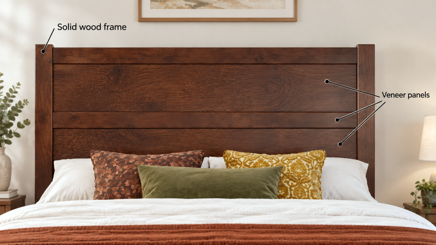
Wood is a natural material, so grain, tone, and color can vary from one piece to another. Even within the same product, one board may look slightly lighter, darker, warmer, or show more grain than the piece beside it.
The material underneath the finish can make a difference too. Depending on the product, wood furniture may be made from solid wood or a combination of solid wood and wood veneer. These materials can absorb and display stain differently, so a solid wood frame may not look the same as a veneered panel even when both receive the same finish.
Even two pieces of solid wood can take stain a little differently because the grain and natural characteristics of each board are unique.
That means a rail, panel, drawer front, or other component may not look perfectly identical to the piece next to it, even though they are finished in the same color. You may notice subtle differences in warmth, depth, grain, or how strongly certain undertones appear.
These differences are easier to see with stained finishes because the wood remains visible beneath the color. Painted finishes tend to appear more consistent because the paint covers the natural variations of the wood.
These differences are normal with wood furniture and are part of what gives each piece its own character. They do not mean the components were finished in different colors.
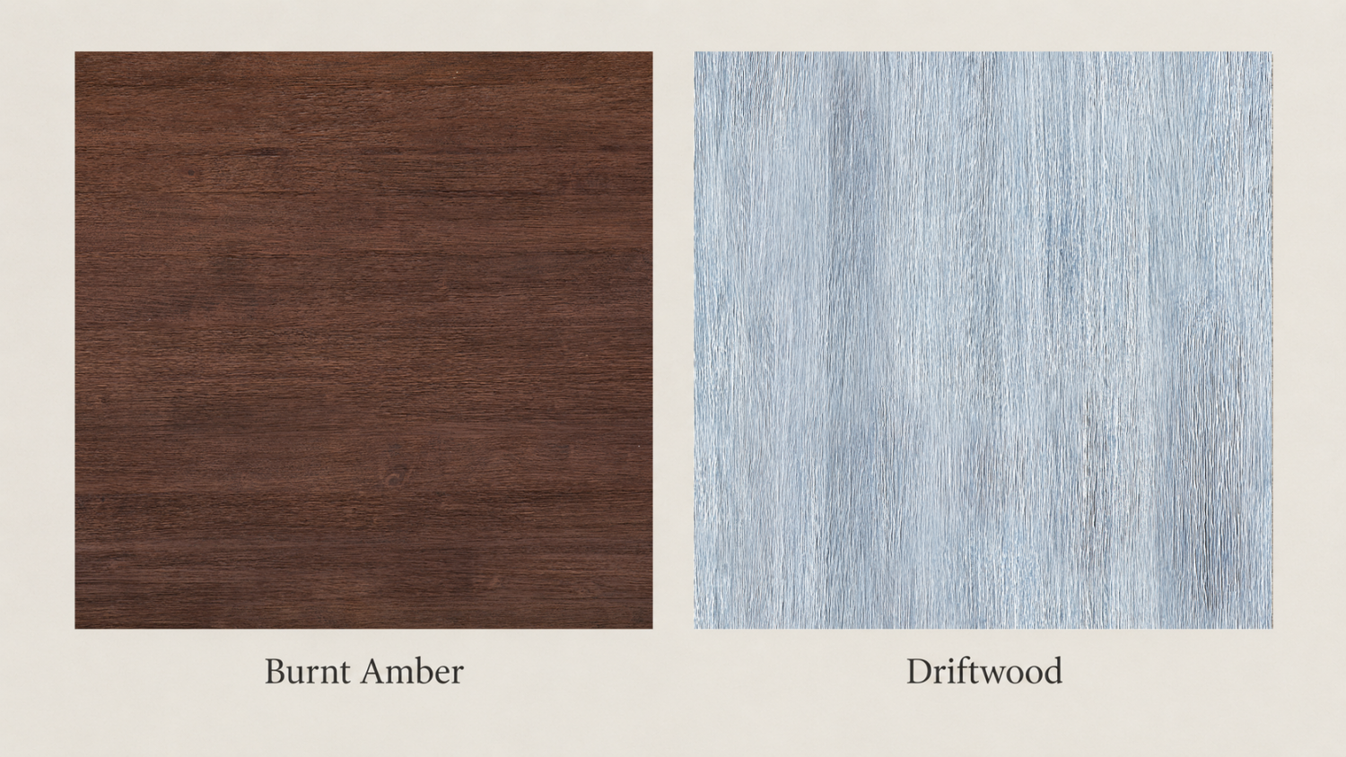
Some finishes change more than the color of the wood. AFI’s Burnt Amber and Driftwood finishes are wire-brushed, giving the surface more visible texture and bringing greater emphasis to the grain.
That texture adds depth and gives the furniture a more tactile, natural appearance. Burnt Amber has a warmer, richer tone, while Driftwood has a lighter, cooler look.
Both finishes are a good choice when you want the wood itself to contribute more texture and character to the room.
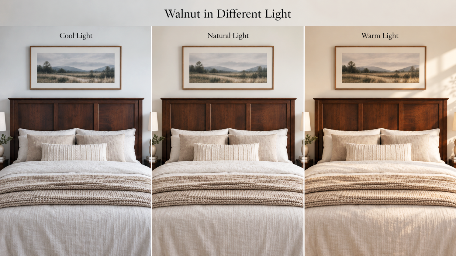
Lighting can have a noticeable effect on the way a furniture finish looks in your home. Natural daylight can bring out grain and warmer undertones, while artificial lighting can shift the same finish warmer, deeper, or more subdued.
Our Walnut Finish is a great example of this. In bright or warm light, its red and amber undertones can become more noticeable, sometimes giving it a richer, almost mahogany-like appearance. In softer or dimmer light, the same Walnut finish may appear deeper brown with less noticeable red.
Sheen also affects how a finish responds to light. AFI’s stained finishes have more gloss than the painted finishes, so they reflect more light and can reveal more of the grain and tonal variation. Matte painted finishes reflect light more softly, helping the color appear more even across the surface.
When choosing a finish, consider the lighting in the room where the furniture will be used. Strong sunlight, limited natural light, warm lamps, cool bulbs, and even surrounding wall colors can all influence how a finish appears.
The color shown in a swatch is a helpful starting point, but the room and its lighting will always play a part in how that finish looks in real life.
When shopping for furniture online, the screen you are using can change how a finish appears before the furniture ever reaches your home.
An online swatch is useful for understanding the overall direction of a finish, but it cannot reproduce color perfectly. Phones, tablets, and computer monitors all display color differently depending on their screen technology, brightness, contrast, and color calibration. Settings such as Night Shift, Night Light, blue-light filters, or other warm display modes can shift colors noticeably warmer, while a brightly calibrated screen may make a finish appear lighter or more saturated.
Photography introduces another layer. Camera settings, editing, studio lighting, and natural daylight can all affect how much warmth, grain, or contrast appears in an image.
The way a product is styled can influence perception too. A Walnut piece photographed with cream bedding and warm beige walls may appear richer and warmer, while the same finish surrounded by cool greys, whites, or blues may seem more neutral or subdued. Our eyes naturally judge color in relation to the colors around it.
Color perception can also vary somewhat from person to person, so two people looking at the same image may not describe the tone in exactly the same way.
For these reasons, it is best to use an online swatch as a guide to the overall finish rather than an exact color guarantee.
When possible, look at the finish in several ways: the swatch, close-up product photography, and full room settings. Together, they give a better sense of whether a finish is light or dark, warm or cool, matte or glossier, smooth or textured, and how it may interact with the colors already in your home.
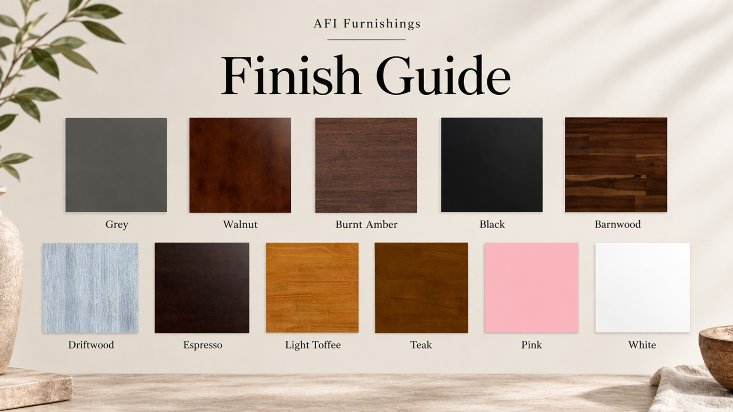
AFI’s most popular finishes cover a range of looks, from warm natural wood tones to clean painted colors. Some are close enough in depth or color that the differences can be harder to judge online, so it helps to compare them side by side. Here are a few of the distinctions shoppers are most likely to notice.
Walnut, Teak, and Light Toffee are all stained finishes that keep the grain and natural variation of the wood visible, but their overall tones are quite different.
Walnut is the deepest of the three, with a rich brown color that can reveal more red undertones in warmer or brighter light. Teak is a more neutral medium brown with just enough warmth to keep it from feeling cool. It sits naturally between Walnut and Light Toffee. Light Toffee is noticeably warmer and lighter, with stronger caramel, golden, and orange tones.
If you want a richer wood tone, Walnut offers more depth. Teak works well when you want a balanced, neutral brown, while Light Toffee brings the most visible warmth of the three.
Espresso and Black can both give furniture a dark, grounding presence, but the finish itself creates a very different look.
Espresso is stained, so the wood grain, tonal variation, and natural character remain visible beneath the dark color. That makes it a good fit for rooms where you want more texture and an organic, collected feel.
Black is painted, creating a more consistent matte surface with very little visible variation. The result is cleaner and more uniform, making it a natural choice for a more modern look.
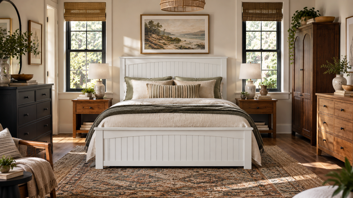
White offers the lightest look among AFI’s most popular finishes. Because it is painted, the surface is matte and more uniform than a stained wood finish. It works especially well when you want the furniture to feel visually lighter or when you want wall color, textiles, flooring, and other wood tones to stand out around it.
No. Mixing wood tones can actually make a room feel more natural and collected than using the exact same finish everywhere.
The easiest way to make different woods work together is through contrast. A darker Walnut or Espresso piece can sit comfortably with lighter flooring or furniture, while a lighter wood tone can work alongside darker accents without looking mismatched.
Look for a common thread rather than an exact match. Similar warmth, repeated tones in a rug or textile, or a few natural accents can help different finishes feel connected throughout the room.
The goal is not to match every wood surface. It is to make the mix feel intentional.
Choosing a wood furniture finish is not simply choosing a color.
It is a decision about color, grain, sheen, texture, material, light, and how the furniture will relate to everything else in the room.
Stained finishes allow more of the natural grain and tonal variation to remain visible and have a glossier appearance. Painted finishes create more consistent color with a softer matte look. Wire-brushed finishes introduce another layer of visible and tactile texture.
Solid wood and veneer can also display the same stain somewhat differently because the underlying materials interact with the finish in different ways. Paint generally minimizes those differences and creates a more uniform appearance.
Natural wood can vary from piece to piece, even within the same finish, and lighting can bring different undertones forward throughout the day.
When shopping online, remember that a phone, tablet, or computer screen cannot reproduce a furniture finish perfectly. Use finish swatches, product photography, and room settings together to understand the overall direction of the color rather than expecting a digital image to serve as an exact match.
The goal is not to make every wood surface in the room identical. It is to choose a finish that gives the furniture the right presence in the space and works naturally with the colors, materials, and light already around it.
Ready to explore the options? Shop AFI Furnishings and use the Finish filter to browse the colors and wood tones available across the collection.